Many local business owners build their sites by stacking as many offers as possible in front of visitors, hoping one of them sticks. You will often find a quote request form, a newsletter box, a floating chat window, and multiple buttons all on the same screen.
This approach confuses visitors and makes your business look disorganized. When a potential customer faces too many competing directions at once, the brain struggles to pick a single path. The visitor simply leaves the page to find a website that makes the next step obvious.
What Happens When Visitors Have Too Many Options
At our Layton web design agency, we explain this to customers by asking them to think in terms of shopping online. When a website gives you one clear step, you take it. When it throws 20 different offers at your face, you get overwhelmed and close the tab. Human brains are wired to avoid extra mental work. People will leave a website entirely before they spend time figuring out a messy layout.
Your website handles your customers the exact same way. A local lead lands on your page ready to book a service or ask a question. Before they can click anything, they have to wade through distractions. A pop-up asks for their email, a banner promotes a sale, and a chat window opens up automatically. On top of that, you have four different colored buttons all pointing to different pages. Instead of taking action, your visitor spends their time trying to figure out what you want them to do next. It’s analysis paralysis, and most people will not stick around to work it out.
The frustrating part is that every single button seems to have a good purpose. Your quote form captures leads, your chat widget handles customer service, and your banner highlights a current discount. None of these tools is bad on its own. The real issue is the pile-up. When every element fights for attention, your main goal gets completely buried.
This is not a failure on the part of your customer. It is just a sign that your webpage is trying to do too many jobs at once.
Is Your Site Cluttered?
Cluttered call-to-action (CTA) experiences are not always obvious. Some of the most overwhelming pages look perfectly clean when you first open them. You only notice the issue when you sit down and count the requests you are making.
Open your homepage and list everything you ask a visitor to do. Count the:
- Popups and chat triggers
- Newsletter signups and social follow buttons
- Contact forms and free consultation offers
- Product showcases and navigation options
Do the same for your service pages, your blog, and your landing pages. Most business owners are surprised by how many competing demands are built into a single page once they stop and count them all.
One sign worth watching for is high traffic with low conversions. If plenty of Davis County residents visit your site but your phone never rings, your page is usually asking too much.
Why Homepages Are Especially Vulnerable
The homepage gets more attention than any other page on your website, which is why it runs into trouble. If you have partners or managers, everyone wants their specific priority featured right at the top. The sales side wants a booking link. Marketing wants an email signup box. You want your company history and awards front and center. The result is a page that tries to do everything and succeeds at very little.
A homepage has one job: welcome your visitors and point them toward the right next step. That step depends on who they are and what they need. If you offer multiple services, your homepage should help people find the right section quickly. It should not try to answer every question or close every sale in a single scroll.
The pages that get more customer inquiries have one clear main button, with the rest of the text building trust underneath it. Extra details should inform your visitors, not fight for their attention. Everything else is just noise that slows people down before they ever reach out to your business.
When your website analytics show that visitors are leaving your homepage quickly, or clicking randomly between pages without ever contacting you, you are likely looking at the same root cause: too many competing CTAs. The fix is reducing the number of choices you force your visitors to process at one time.
A strategic partner can help you solve this problem. Depending on your platform, that partner may be a Shopify, WooCommerce, or WordPress web design agency. A professional team ensures your homepage focuses on a single path that turns local visitors into paying customers.
One Primary Action Per Page
Every page on your website should have a single call to action: one outcome that takes priority over everything else on that page. Secondary options can exist, but they should be visually subordinate. A visitor’s eye should land on the primary action without having to sort through competing signals first.
Setting up a clear layout hierarchy allows you to keep multiple links without creating confusion. For example, a service page can feature a prominent button to request an estimate. Underneath that main button, you can add a small text link to read a past customer story, and a separate link to explore other services. All three options can live on the page because the design makes the most important step obvious.
Think about what single thing you most want the visitor to do after reading each page, not everything you’d like them to do. Focus on the one action that matters most for that specific page and that specific visitor at that specific stage in their decision. Design around that outcome, and let everything else serve a supporting role rather than a competing one.
Simplicity Takes More Work Than Clutter
Clutter happens when you add without removing. Simplicity requires decisions about what matters enough to keep and what needs to go. That takes a clear picture of who your visitor is, what they need at each stage of their journey, and what the most valuable outcome is for each page on your site.
Most businesses don’t realize how much their websites are asking of visitors until they see the bounce rates and low conversion numbers. By then, the habits that created the problem are already baked into how the site is maintained.
A skilled design partner approaches that thinking before the first page is ever designed. When the hierarchy is right from the start, your site guides visitors where they need to go rather than overwhelming them at every turn. Retrofitting good decision architecture onto pages that were never built with a clear purpose is harder than doing it right the first time, and it usually shows.
If your site is asking too much of your visitors, a custom web design agency can rebuild it around one clear goal per page, with CTAs that get your phone ringing and your contact forms filled.
Video

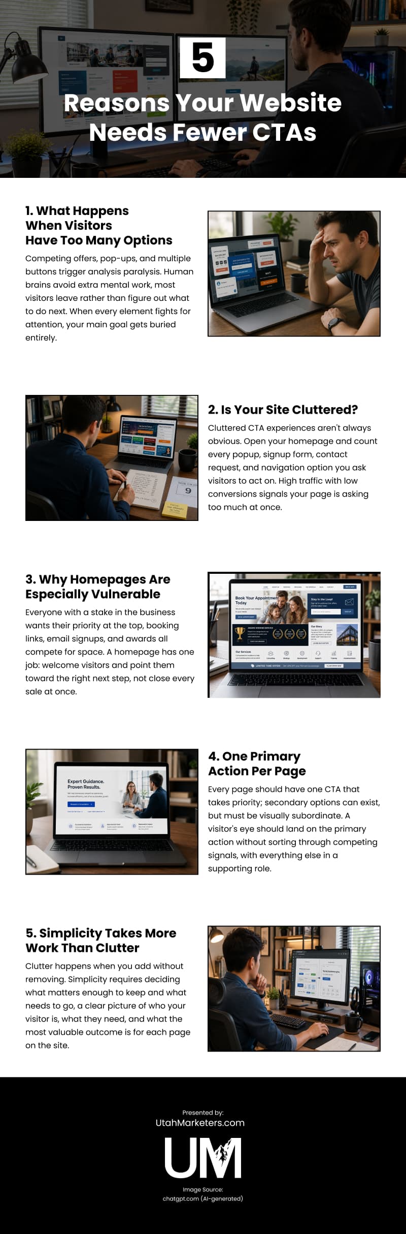
Infographic
Too many calls to action don’t increase conversions; they prevent them by triggering analysis paralysis that sends most visitors away before they ever take the next step. Discover reasons your website needs fewer CTAs in this infographic.