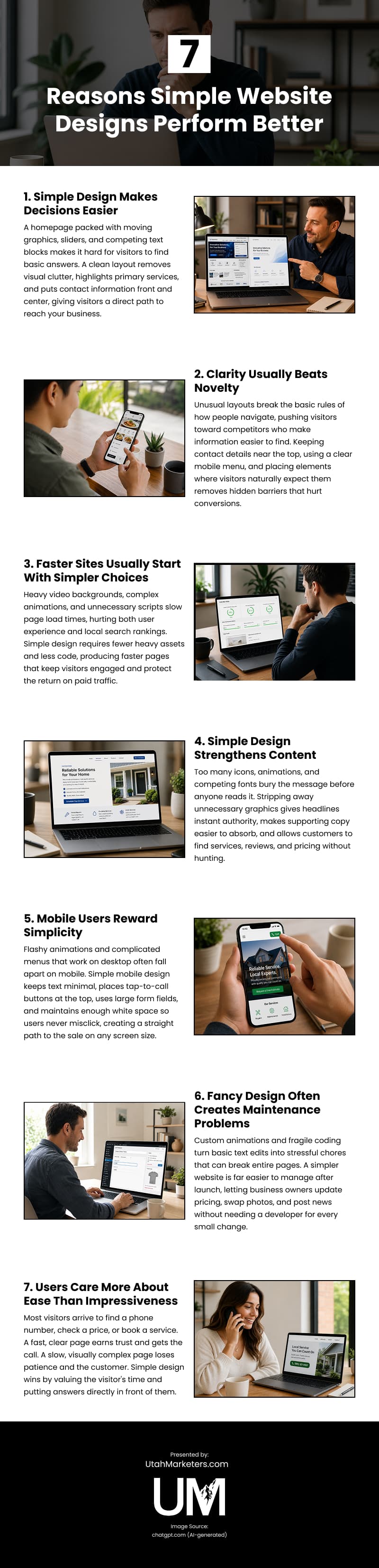
It is easy to think that flashy animations and complex layouts make a business look modern. The reality, however, is that over-designed pages frustrate customers and prevent them from finding relevant information.
People visiting local business sites have a certain perception of how a website should work. They expect to see information like social proof, service options, and contact details immediately. Navigation is a map that guides them smoothly so they can find services, read reviews, and get in touch with you right away.
At our Layton website design company, we guide customers toward simple, clean, and engaging designs that retain visitors on your site. That’s because streamlined design consistently pays off.
Simple Design Makes Decisions Easier
When a customer visits your website, their brain immediately starts asking basic questions. What do you actually do? Are you near me? How do I get a quote? If your homepage is packed with moving graphics, automatic sliders, and competing text blocks, finding those answers becomes a chore.
A clean layout fixes this by removing unnecessary visual clutter. It highlights your primary services and puts your contact information front and center. As a result, visitors can find what they need at a glance.
An intuitive layout makes the buying process easier and gives potential clients a direct path to contact your business.
Clarity Usually Beats Novelty
It’s tempting to choose an unusual layout in a bid to look different. But when a website gets too creative, it breaks the basic rules of how people navigate.
Imagine opening a local restaurant’s website and facing a heavy video intro on the homepage instead of a clear dinner menu. This not only causes inconvenience but also drives people away to a competitor who makes basic details easy to find.
Clarity requires keeping important elements where visitors naturally expect to find them. For instance, place your contact details near the top of the page and use a clear mobile menu so visitors can quickly reach your pricing or contact us page.
When you stick to these familiar habits, you remove the hidden barriers that hurt conversions and make it easier for people to trust your business.
Faster Sites Usually Start with Simpler Choices
Fancy web design often carries more bloat. From large video backgrounds to complex animation scripts, it contains a lot of unnecessary elements that slow down page loading time. Simple design tends to perform better because it requires fewer heavy assets and less code.
As a Core Web Vitals metric, page speed also affects your local search rankings, since Google actively rewards fast websites and penalizes slow ones. Plus, it keeps your paid traffic from bouncing. When you drive people to your site through local ads or SEO, a fast page makes sure they stick around long enough to check out your services.
Simple Design Strengthens Content
Small business websites convert when the core offer is easy to read. Too many icons, animations, or competing fonts bury the message before anyone gets to it. Good copy needs a clear hierarchy and enough contrast to guide the eye.
Stripping away unnecessary graphics gives your remaining text instant authority. Your main headlines become easy to read, and the supporting copy across your pages becomes easier to absorb and act on. Because the layout stays clean, customers can find what they need without hunting for it.
This builds trust fast for local service businesses. Your site communicates your process, reviews, and pricing without making anyone search for them. As such, people consume more of your content.
Mobile Users Reward Simplicity
Mobile browsing raises the stakes for website owners. Smaller screens give you minimal to zero space for flashy animations and complicated dropdown menus. A design that works well on desktop can easily fall apart on mobile if you integrate too many visual elements in the layout.
Simple mobile design performs better because it respects the limits of the screen. It creates a straight path to the sale by keeping your text minimal and your layout functional:
- Tap-to-call buttons sit right at the top so clients don’t search for your number.
- Short bullet points replace long text blocks so users can skim your services while on the move.
- Large form fields let people easily type in their name and email without zooming in.
- Sufficient white space keeps links separated so users never misclick the wrong page.
To test this yourself, open your website on your phone right now. Try to call your own business or find your hours in under 5 seconds. If your thumb struggles to hit the right link, or if you have to scroll past giant images to see your pricing, your mobile text is getting buried.
Fancy Design Often Creates Maintenance Problems
A simpler website is much easier to manage after your launch. Most business owners forget that once a site goes live, someone has to update pricing, swap team photos, and post current company news. When your layout is packed with custom animations and fragile coding, making a basic text edit can easily break the entire page.
Take a local bakery using WordPress to manage their site, for instance. The owner just wants to jump into the dashboard to swap out a weekend special or change a cake price. Instead, they’re met with overly complex layout templates and fragile custom blocks that break with the slightest change. That not only delays things but also turns a 2-minute update into a stressful chore.
That’s why it’s important to choose a WordPress web designer who prioritizes clean design over flashy gimmicks. Although such designers are in the business to make money, they know that clients benefit much more from a site that works flawlessly every single day.
Users Care More About Ease Than Impressiveness
Most customers visit your site to find a phone number, check a price, or book a service. When your page gives them these answers fast, they trust your business and reach out. When a messy layout forces them to hunt, they lose patience and click away.
You probably do the same thing yourself. You choose the company with clear contact details over the one with a slow video background. Simple websites win because they value a customer’s time. They put your business answers right in front of the buyer instead of hiding them behind graphics.
Simplicity does not mean sacrificing a premium, modern look. With a clean design and focused layout, you can still build deep customer trust while making your service look professional.
Video

Infographic
Simple website design consistently outperforms fancy alternatives because it removes the friction between a visitor and the action you want them to take, faster, clearer, and easier to maintain at every stage. Discover seven reasons simple website designs perform better in this infographic.