You shouldn’t judge a book by its cover, but you can judge a website by its header. The header is the first thing visitors see, and as with any first impression, it matters.
Think of it like the table of contents in a book—it helps visitors quickly find what they’re looking for. Just like you start reading a book from the first page, when navigating a website, you start at the top and work your way down. That’s why your header needs to include all the key information and navigation links your visitors might need right from the start. It should also include a glimpse into your brand and what sets you apart.
Headers are essential to the usability of your website. They make navigation easier, showcase your brand, and boost engagement with calls to action.
What is a Website Header?
Your website header is the section or banner at the top of the website that contains the brand logo and search bar, navigation links, options to sign up or log in, and specific calls to action for interested customers. It gives a brief overview of your brand and what you’re all about. A strong designer will keep readers interested and on your webpage. Chaotic design can frustrate users, resulting in higher bounce rates and fewer sales.
What Type of Website Header Should I Use?
When it comes to your header, you need to make the most of your space—strategically including all the relevant information for your website. Depending on your website’s unique needs, products, services, and target audience, this could look different.
Because of this, the type of header you choose will vary depending on your website’s goals. A simple site might just need a logo and key details, while an eCommerce site would likely require a search bar, sign-up button, logo, and more. There are eight main header types that we will explore below.
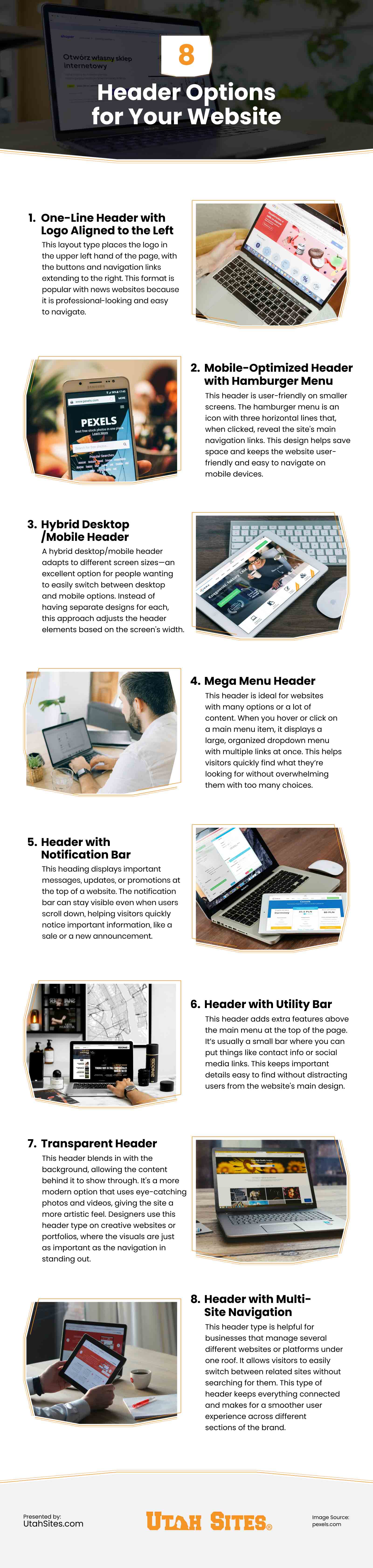
1. One-Line Header with Logo Aligned to the Left
This layout type places the logo in the upper left hand of the page, with the buttons and navigation links extending to the right. This format is popular with news websites because it is professional-looking and easy to navigate.
2. Mobile-Optimized Header with Hamburger Menu
This header is user-friendly on smaller screens. The hamburger menu is an icon with three horizontal lines that, when clicked, reveal the site’s main navigation links. This design helps save space and keeps the website user-friendly and easy to navigate on mobile devices.
3. Hybrid Desktop/Mobile Header
A hybrid desktop/mobile header adapts to different screen sizes—an excellent option for people wanting to easily switch between desktop and mobile options. Instead of having separate designs for each, this approach adjusts the header elements based on the screen’s width.
4. Mega Menu Header
This header is ideal for websites with many options or a lot of content. When you hover or click on a main menu item, it displays a large, organized dropdown menu with multiple links at once. This helps visitors quickly find what they’re looking for without overwhelming them with too many choices.
5. Header with Notification Bar
This heading displays important messages, updates, or promotions at the top of a website. The notification bar can stay visible even when users scroll down, helping visitors quickly notice important information, like a sale or a new announcement.
6. Header with Utility Bar
This header adds extra features above the main menu at the top of the page. It’s usually a small bar where you can put things like contact info or social media links. This keeps important details easy to find without distracting users from the website’s main design.
7. Transparent Header
This header blends in with the background, allowing the content behind it to show through. It’s a more modern option that uses eye-catching photos and videos, giving the site a more artistic feel. Designers use this header type on creative websites or portfolios, where the visuals are just as important as the navigation in standing out.
8. Header with Multi-Site Navigation
This header type is helpful for businesses that manage several different websites or platforms under one roof. It allows visitors to easily switch between related sites without searching for them. This type of header keeps everything connected and makes for a smoother user experience across different sections of the brand.
Tips for Designing a Strong Header
- Embrace Visual Hierarchy—Organize items in order of importance in a way that looks good and makes sense. Calls to action should be easy for the user to follow.
- Use Vertical Design—Vertical header menus are a convenient option, as they allow you to add considerably more links without filling the header.
- Keep it Simple—A clean and easy layout helps visitors find what they need without getting overwhelmed. Avoid adding too many links, buttons, or images that could distract or confuse people.
- Design With Your Audience in Mind—Use design features that appeal to your target audience. Imagine you own a hiking goods store in Ogden, Utah. If part of your brand identity is a commitment to the environment or the outdoors, use colors, videos, and images that appeal to your ideal audience.
- Stick to Your Brand Identity—Your logo should stand out clearly in the header, and the style, fonts, colors, and tone should all work together consistently. This creates a cohesive look that makes your brand feel trustworthy and professional.
Conclusion
The most effective websites have a compelling website header. Start by defining your business goals and choose the best header option to support those goals. Visitors to your website should quickly feel right at home and be able to navigate quickly to find the information they need. This helps you turn website visitors into paying customers.
Use these tips to create a web experience your users will want to interact with. If you are looking for design professionals who can create a website header that is perfect for your unique business, contact our custom web design agency serving Salt Lake City, Orem, Ogden, Layton, Provo, and surrounding areas.
Infographic
Website headers play a key role in branding and user experience. A well-crafted header improves navigation, maintains a clean design, and boosts engagement. This infographic highlights different header styles to consider for your site.