You can spend thousands driving local traffic to your website and still watch visitors leave without taking action. They land on your page, look around for a few seconds, and disappear. Your product is solid. Your pricing is competitive. The problem is the website itself.
If you’re comparing Ogden website design companies, don’t just focus on which portfolio looks best. Focus on which websites actually convert visitors into customers. Good design guides people toward action. Bad design creates hesitation and sends them somewhere else.
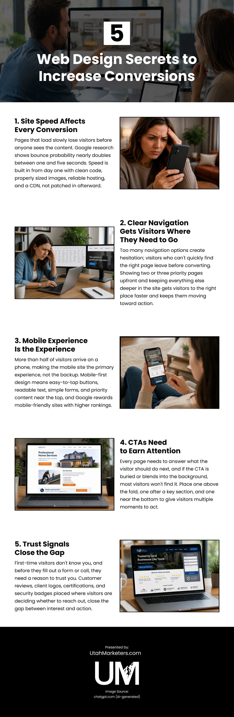
Here are five web design principles that drive business.
1. Site Speed Affects Every Conversion
Online visitors are impatient.
They expect pages to load in under two seconds. Every second after that gives them another reason to leave. Google’s research found that the probability of a bounce nearly doubles as load time increases from one second to five.
If your website is slow, you may be losing leads before anyone even picks up the phone.
Speed isn’t something you add on later. It’s built into the website from day one with clean code, properly sized images, reliable hosting, and a CDN that serves files from a location close to every visitor.
Picture what happens when you launch a promotion. Traffic spikes, and a well-built, streamlined website barely notices. But if you have a bloated site, it will slow to a crawl or crash when you need it most.
That’s the difference between building for speed and chasing fixes after launch. One delivers consistent performance. The other becomes a cycle of patches that gets harder and more expensive to maintain.
2. Clear Navigation Gets Visitors Where They Need to Go
Your navigation is the first thing visitors use to figure out your website. When every service, category, and supporting page sits in the main menu, visitors don’t know where to click. Too many choices create hesitation.
Your navigation has one job: help visitors find the right page quickly. Show the two or three pages most people are looking for first. Everything else can live deeper in the site.
Many businesses try to solve this with a mega menu packed with dozens of links. The menu looks more organized, but visitors still have too many choices. Fewer, clearer options almost always perform better.
Picture someone in Ogden looking for a specific service. They open a dropdown. Click the wrong page. Hit Back. Try again. Thirty seconds later, they’re gone. Clear navigation gets visitors where they need to go the first time and keeps them moving toward a conversion.
3. Mobile Experience Is the Experience
It’s estimated that more than half of visitors arrive on a phone. Your mobile site isn’t the backup version of your website. For most visitors, it is your website.
Mobile design starts with the smallest screen. Make buttons easy to tap. Use text that’s easy to read. Keep forms simple. Put the most important information near the top instead of hiding it behind oversized images.
Businesses that get mobile right think differently. They start with the person holding the phone. What does that visitor need? How can they get it with as few taps as possible?
Visitors aren’t the only ones who notice mobile-friendliness. Google considers your mobile site and rewards it with higher rankings.
4. CTAs Need to Earn Attention
Every page on your site needs to answer one question: what should the visitor do next? Your call to action (CTA) provides that answer. If your main button is buried at the bottom or blends into the background, people will scroll right past it.
Think about the last time you tried to get a quote from a website and could not figure out where to click. If your CTA isn’t clear, most prospects will give up before they ever reach the end of your form.
Strong CTAs tell visitors exactly what happens next. “Get a free quote” is clearer than “Contact us.” “Schedule your consultation” is clearer than “Submit.”
Don’t rely on one button. Place one above the fold, another after an important section, and a final CTA near the end of the page. Visitors decide at different moments. Give them more than one chance to act.
5. Trust Signals Close the Gap
When visitors land on your website for the first time, they don’t know you. Before they fill out a form or pick up the phone, they need a reason to trust you.
Think about two local businesses offering the same service. One has a phone number and a list of services. The other shows customer reviews, completed projects, recognizable client logos, and a five-star rating. Which one would you contact?
Customer reviews. Client logos. Relevant certifications. Security badges. You don’t need them on every page, but you should add them where visitors are deciding whether to reach out.
And don’t forget that it’s not just about gaining trust; you also need to avoid losing it. An outdated design, generic stock photos, or inconsistent pages all make people wonder what else has been overlooked. People judge your business long before they become customers.
Design Is Where Conversions Start
Driving traffic is only half the job. Your website has to turn those visitors into customers.
The five principles in this guide are the difference between a website that simply looks good and one that helps your business grow.
If you’re ready to invest in custom web design, Utah Marketers builds websites designed to convert from day one. Let’s create a site that works as hard as you do.
Video

Infographic
A website that looks good but doesn’t convert is a missed opportunity, and the gap between attracting visitors and turning them into customers comes down to a handful of deliberate design decisions. Read on about web design secrets to increase conversions in this infographic.